Corporate and Office Lobby Design
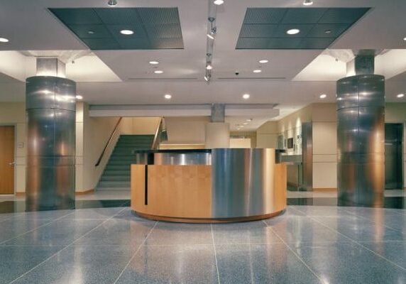
This week, we’re talking about the important elements necessary for office lobby design and lobby architecture. The entrance to an office needs to be functional and beautiful at the same time. By layering stones, glass, lacquers, and other materials, Mojo Stumer has created show-stopping lobbies for various companies and corporations. These are the areas that facilitate some of the most movement within the building, so it is only right that the office lobby design is carefully constructed to meet the requirements and needs of the client.
LUXOTTICA NYC OFFICE
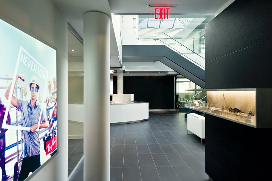
The first lobby we will be focusing on is the one we created for North American corporate headquarters – Luxottica – the largest distributor of eyeglasses in the world. To this Italian-owned company, design, and optics (insert glasses pun here) are important, as they should be. Upon entrance into the main lobby, the company’s product and mission are immediately clear and emphasized with a dramatic double-height space. For a company that sets the standard for sunglasses, we wanted to allow as much skylight as possible into the common areas – creating a sunny, daylight feeling. The cafeteria is a sunny and lush oasis for employees to enjoy a space designed for relaxation. With this project, we’re most proud of the fact that we truly created a ‘Town Square’ effect where the design is the foundation of a fundamentally collaborative and social space. Being able to share freely and talk amongst each other in an office setting is important for fresh ideas to be created, and the ‘Town Square’ effect really works to bring out the best in people. Creating the Luxottica NYC office for their North American corporate headquarters was a fulfilling project that Mojo Stumer was proud to be a part of.

BWD INSURANCE
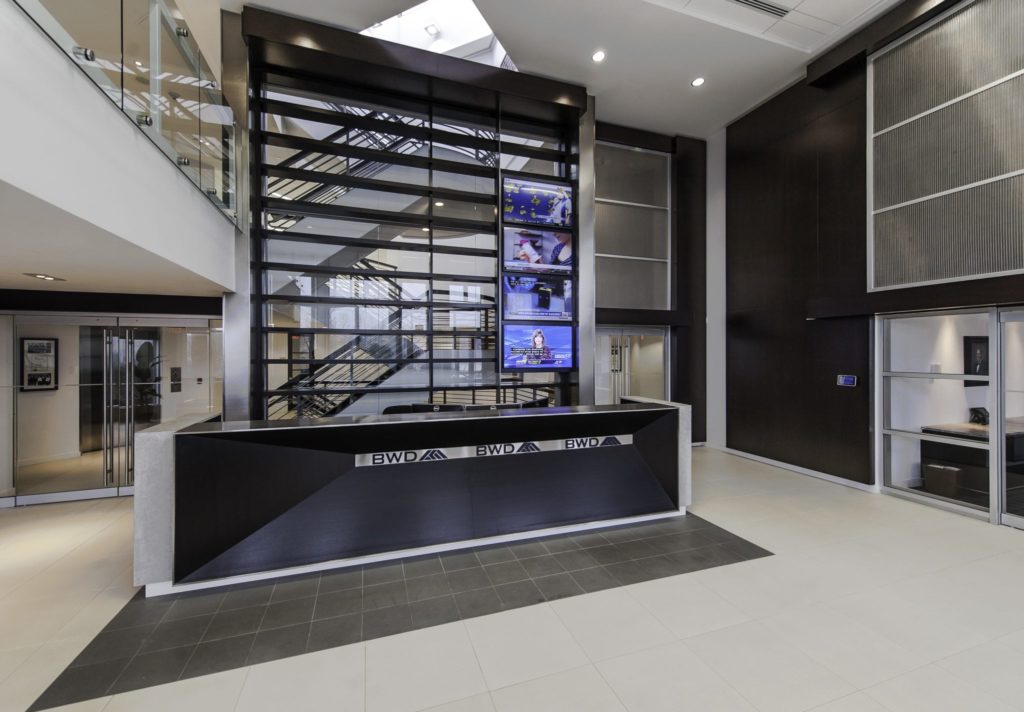
Another lobby we are featuring is one for an insurance company (that ensures pro sports leagues like the NHL and NBA) that wants to break free from the ‘boring’ stereotype that insurance companies are associated with. The TV’s are always set to be streaming sporting events associated with the company’s work – setting the impression for their corporate identity immediately upon entrance. The transparency through to the office and the 2-story lobby gives a great open-air, collaborative feel buzzing with activity. Here, the reception desk design truly becomes a work of art with its sleek black wood, complementing tiles, and the towering glass wall behind.

ESQUIRE BANK HEADQUARTERS
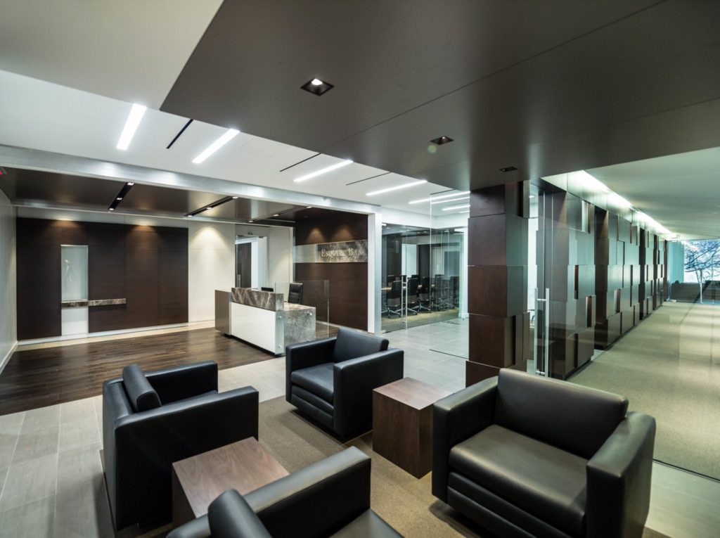
The last lobby we will be talking about is the office renovation we did for the Esquire Bank Headquarters in NYC. Dark Wood Carlisle flooring runs through the reception area as well as gray lacquer ceiling panels and striking stone on the receptionist’s desk. The client lounge is designed with cancos flooring along with Bently carpeting. Modern furnishes were added to enhance the contemporary design of their space which reflects the professional atmosphere they wanted.

Lobbies are so important considering they are the first physical representation of a company’s space that clients and employees will see. It is important for architects and interior designers to work closely together on these sorts of projects to ensure that these spaces are strong, peaceful, and open. Modern architecture can go a long way in designing the perfect lobby for a company and its employees while still being fully functional for use. Check out some pictures of some of the other lobbies we have designed for more inspiration.
