RELATED COMPANIES
New York, NY
This had to be one of our most interesting and challenging projects we’ve taken on to date.
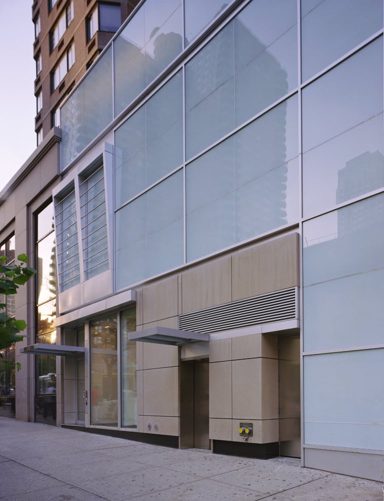
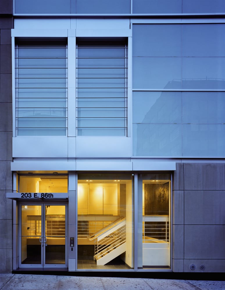
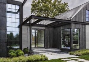
The project consisted of three floors of six thousand square feet which was all below grade and originally storage/mechanical space for a closed Woolworth store that once occupied the corner. The façade at street level consisted of a small, narrow in depth, retail store and two stories of mechanical chiller equipment for the apartment building above. Our clients asked us to turn this into high-end corporate office space that was inviting and made its presence known on the street. The challenge was overcome by disguising the mechanical space above the new lobby, behind opaque spandrel glass and louvers, which angle away from the building. This element pronounces the entry and suggests that the space behind was not mechanical, but perhaps an executive office or lobby area. The rest of the façade picks up on the existing grid and proportions of the adjacent façade to the left. This unites the new entrance to the building as a whole, giving the space a larger perception from the outside. The final product was a light, transparent, inviting façade that alludes to a high-end corporate space beyond the threshold of the glass doors.
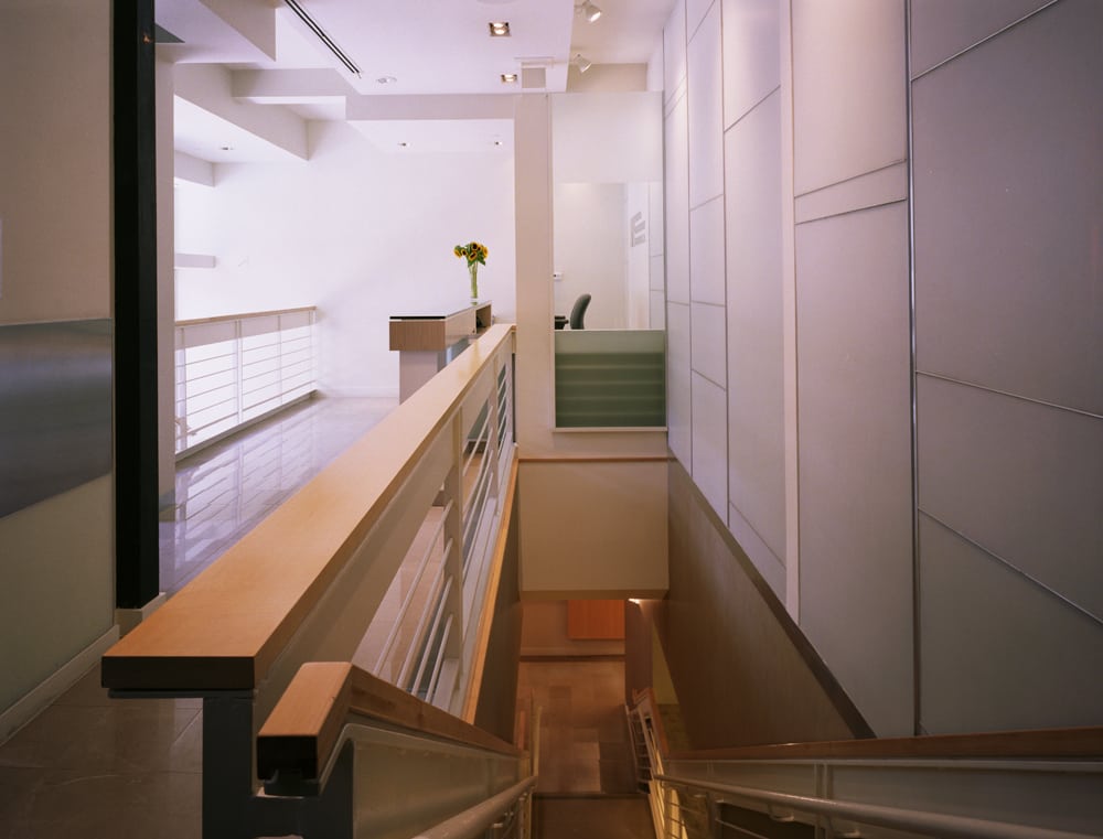
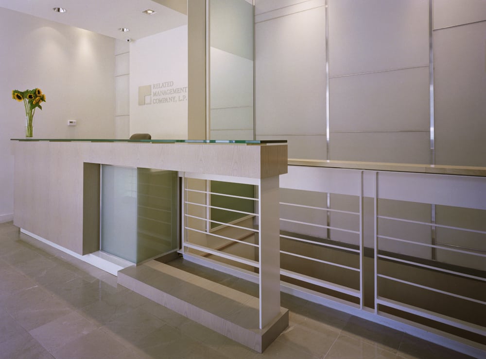
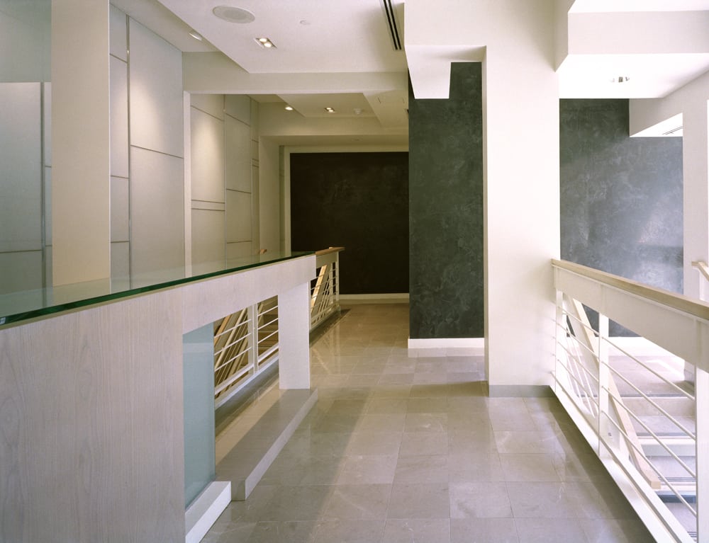
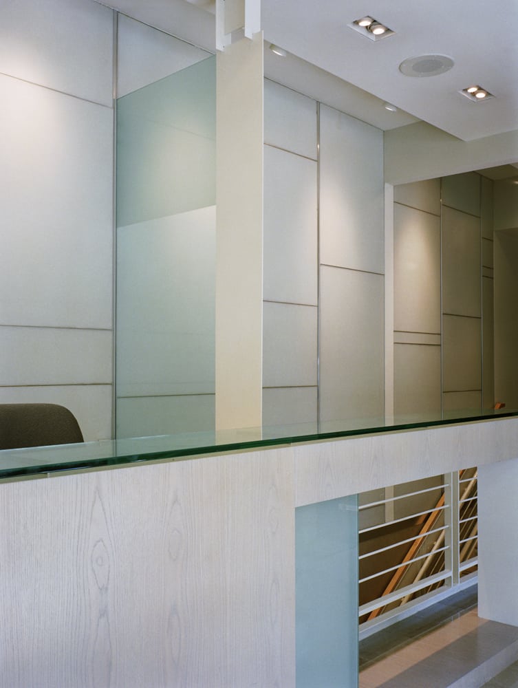
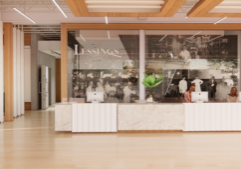
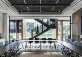
The interior of the lobby, which would take place in the former narrow retail space, consisted of a small space packed with program requirements: a security desk, seating area, an elevator and grand staircase to the three concourse levels below, and a three foot change in elevation from the street to lobby level which made handicapped access difficult. We accommodated this program by creating one large space that was subtly divided through manipulations in the ceiling and floor planes. Upon entry into a lower vestibule, a small stair was used to bring you up to the lobby level from the street. The stair’s railing system provided a visual screen to the reception area and added depth to the façade. Handicap access was provided via the elevator, which was accessible from the lobby level on the inside and through a separate entrance at the street level. This secondary entrance was blended into the façade, which clearly emphasized the predominance of the main entrance. Providing access to the space in this manner eliminated the need for a secondary interior wheel chair lift, therefore increasing the useable space for other program requirements. The main stair was utilized as a design feature by adding a back lit luminescent wall which brought light from the lobby down to the floors below. This helped to create an inviting light filled vertical precession through the space. The building has been open since spring 2002.


